Project: Library De Witte Dame, Eindhoven, the Netherlands
Architect: Koen van Heeswijk
Product: tretford INTERART rugs, in various colour combinations
The identity of libraries is changing. They are required to position themselves increasingly more clearly: what is their added value? After all, for children the principal books are already available in the schools themselves. The available space must be used more efficiently. The task for the library in Eindhoven was to accentuate the library's industrial character. Furthermore, it had to be 'pure'.
The architect settled on a calm foundation and used colour to add accents. To provide for a more efficent overview, the library has been divided into colour worlds with clear routing provided by primary colours. 'Pure and simple communications, the art of leaving things out.' Key areas of focus during the renovation were efficiency, identity, flexibility, identifiability and findability.
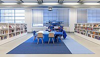
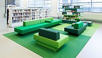
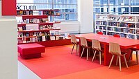
To increase efficiency things had to be scaled down and existing resources such as book cases were reused. In addition, fixed and flexible computer workspaces were created. Identifiability and findability is reflected in the subdivision of the various worlds: blue - literature & culture, green - life & love, red - thrillers & action, purple - image & sound and yellow - science.
The distinctive colour worlds are also identifiable and visible from the coloured tretford rugs.
Even a visit to the washroom is special because of the spatial atmosphere and the use of the colour orange, which is also used for the outdoor signage. Pure, simple with a distinctive identity.